Karo Graph
Colors Help
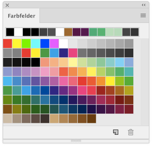
You may choose from 50 different colors in Karo Graph. You find them all on the right hand side of the expanded tools palette.
In the image, you see all colors with their corresponding ID as shown in the tools palette. Below, you find a listing of all colors with their corresponding names, IDs and color values both for RGB as well as for CMYK exports.
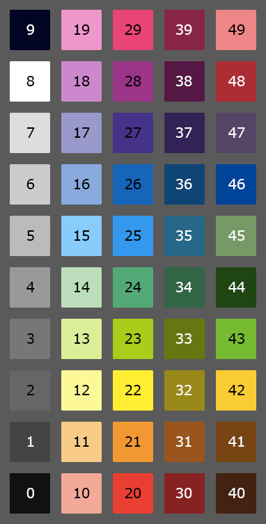
Name             ID        R    G    B     C   M   Y   K
--------------------------------------------------------
100% Black        0     0x11 0x11 0x11     0   0   0 100
85% Black         1     0x44 0x44 0x44     0   0   0  85
75% Black         2     0x66 0x66 0x66     0   0   0  75
65% Black         3     0x77 0x77 0x77     0   0   0  65
50% Black         4     0x99 0x99 0x99     0   0   0  50
35% Black         5     0xbb 0xbb 0xbb     0   0   0  35
25% Black         6     0xcc 0xcc 0xcc     0   0   0  25
15% Black         7     0xdd 0xdd 0xdd     0   0   0  15
White             8     0xff 0xff 0xff     0   0   0   0
Brilliant Black   9     0x00 0x00 0x22   100   0   0 100

Name             ID        R    G    B     C   M   Y   K
--------------------------------------------------------
Light Red        10     0xff 0xaa 0x99     0  45  40   0
Light Orange     11     0xff 0xcc 0x88     0  25  50   0
Light Yellow     12     0xff 0xff 0x99     0   0  50   0
Light Lime       13     0xdd 0xee 0x99    20   0  50   0
Light Green      14     0xbb 0xdd 0xbb    35   0  35   0
Light Cyan       15     0x88 0xcc 0xff    50   0   0   0
Light Blue       16     0x88 0xaa 0xdd    50  25   0   0
Light Violett    17     0x99 0x99 0xcc    45  45   0   0
Light Purple     18     0xcc 0x88 0xcc    25  50   0   0
Light Magenta    19     0xff 0x99 0xcc     0  50   0   0

Name             ID        R    G    B     C   M   Y   K
--------------------------------------------------------
Red              20     0xee 0x33 0x33     0  90  80   0
Orange           21     0xff 0x99 0x00     0  50 100   0
Yellow           22     0xff 0xee 0x00     0   0 100   0
Lime             23     0xaa 0xcc 0x11    40   0 100   0
Green            24     0x44 0xaa 0x77    70   0  70   0
Cyan             25     0x00 0x99 0xee   100   0   0   0
Blue             26     0x00 0x66 0xbb   100  50   0   0
Violett          27     0x44 0x33 0x88    90  90   0   0
Purple           28     0x99 0x22 0x88    50 100   0   0
Magenta          29     0xee 0x00 0x77     0 100   0   0

Name             ID        R    G    B     C   M   Y   K
--------------------------------------------------------
Dark Red         30     0x88 0x22 0x22     0  90  80  50
Dark Orange      31     0x99 0x55 0x00     0  50 100  50
Dark Yellow      32     0x99 0x88 0x00     0   0 100  50
Dark Lime        33     0x66 0x77 0x11    40   0 100  50
Dark Green       34     0x33 0x66 0x44    70   0  70  50
Dark Cyan        35     0x00 0x66 0x88   100   0   0  50
Dark Blue        36     0x00 0x44 0x77   100  50   0  50
Dark Violett     37     0x33 0x22 0x55    90  90   0  50
Dark Purple      38     0x55 0x11 0x44    50 100   0  50
Dark Magenta     39     0x88 0x00 0x44     0 100   0  50

Name             ID        R    G    B     C   M   Y   K
--------------------------------------------------------
Wood             40     0x44 0x22 0x11    20  70  80  80
Caramel          41     0x77 0x44 0x00    10  60 100  60
Mango            42     0xff 0xcc 0x00     0  20 100   0
Grass            43     0x77 0xbb 0x33    60   0 100   0
Forest           44     0x00 0x44 0x11    80   0 100  70
Olive            45     0x77 0x99 0x66    60  30  70   0
Ocean            46     0x00 0x44 0x99   100  75   0   0
Blueberry        47     0x55 0x44 0x66    60  60   0  50
Lipstick         48     0xaa 0x00 0x33     0 100  50  30
Pig              49     0xff 0x88 0x88     0  60  30   0
Developers Blog
Following is a text about how the color palette seen above came to be. It does not give any more information about how to use the Karo Graph Application but it might grant you some insights into the development process behind.
On designing a color palette
Since several years now, there exists an application called Karo Graph
on the App Store. Karo Graph is a small drawing/diagramming application allowing you to place symbols and lines on a grid. The simplicity of the application is loved by many but also limits the capabilities of what can be done. Karo Graph started as a simple ASCII-sketching tool but over time advanced to a more elaborated vector drawing app. Customers sent both praises but also urgent feature requests of what is missing in Karo Graph to not only be a nice little helper but become a perfect tool.
One of the most pressing feature request was the addition of colors. Up until version 1.4, there was just black and white. In version 2.0, I wanted people to be able to use colors in their drawings. Doing so is a much more difficult task than one would imagine in the first place. This article goes through all the ideas and decisions which ultimately lead to a carefully selected 50 colors palette.
Colors? But that's easy, is it not?
No, it definitely is not. Colors have been and still are an ongoing research topic which still to this day have not been thoroughfully nailed down. Current color technologies are all based on standards whereas themselves are (roughly speaking) based on strongly approximated observations from back in 1931. They are far from perfect, but they work.
Using standards is important in the industry. Over the years, several color standards emerged from the 1931 standard observer like XYZ, Luv, Lab and finally RGB, named after the three primary colors Red, Green and Blue. Nowadays, most displays use standardized RGB colorspaces and people creating colorful work are accomodated to use RGB choosers and color palettes.
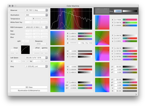
Color Machine: Standard Colorspaces
RGB choosers and color palettes
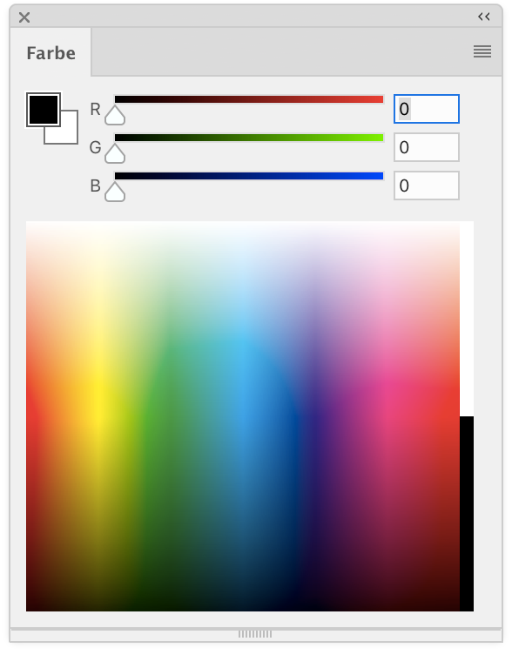
An RGB chooser basically consists of three sliders (Red, Green and Blue) which allow to set the amount of radiance coming from one of the color components. This is a relatively easy to understand concept for most of the people, hence a good choice to use in an application. Using an RGB chooser, creators can use several million or even billion colors. This gives creators a lot of freedom to define colors just how they want. But on the other hand, several million colors is an awful lot to manage. What were the correct values for that beautiful dark orange tone which I used in my logo again? One needs a method to remember these values and organise them in a well-arranged way. That's where palettes come in.
Color palettes are basically a collection of colors. Most commonly, the amount of colors in such a palette is rather small compared to a huge colorspace with millions of colors. A color palette reduces the complex color chooser to a simple selection of carefully chosen colors. There are basically two types of color palettes: User-defined and pre-defined palettes. User-defined palettes are created and managed by the user. He defines, which colors shall be part of the palette and hence has the freedom to choose any number of all the possible RGB values there are. But such freedom comes with a cost: The task of organising such a user-defined palette can be almost as or even more complex as a simple RGB chooser. Not only for the user but also for the programmer.
Predefined color palettes
Predefined palettes can not be changed by a user. Such palettes define one single selection of colors which can not be altered at all. This is of course a clear disadvantage but clearly is very easy to use, as a user will never be bothered with the cumbersome task of manipulating color values at all. It is as simple as it can get: You want Green? Here are three choices. Live with it.
For Karo Graph, there always was one clear goal which influenced the design of the whole application from the start: It MUST be simple to use. And hence it was very clear that when I implemented colors, that I have to use either a simple color chooser or a pre-defined color palette. Anything more would be too cumbersome. And as a color chooser alone without a way to remember color values is not very useful, the decision was quickly made: A predefined color palette it shall be.
Now, the following paragraphs describe the different aspects which I had to make decisions in. Most of them somehow emerged over time and were iteratively ameliorated several times over. I tried things, threw them away, retried, ... But for the sake of a good read, here is the adventure of solving one mystery after another:
Wikipedia: List of color palettes
Which palette? How many colors?
In the next step of the decision process, I had to define, how many colors there shall be and which ones specifically. But do you remember that color science is far from perfect? There are (as seen in the Wikipedia linke above) dozends and hundreds of alreday existing palettes. Many have tried, but there is no single, simple solution. I certainly had a long look at many palettes but ultimately decided that I have to create a unique palette specifically designed for Karo Graph.
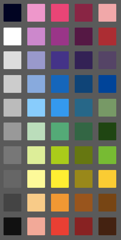
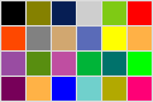
I went for 50 colors. This number is more or less arbitrary but came to be in the following way: During development of version 2.0 of Karo Graph, I started tweeting my implementation progress. To make things interesting for readers, I created GUI mockups like the one on the right. It always was my intention to use the keyboard numbers 6,7,8,9 and 0 to quick-select colors. The actual color palette then shall be visible by expanding the UI. Further more, the expanded UI shall not be too big but there also shall not be too few colors and it shall look somewhat nice and be easy to understand... So I just went with 10 rows and 5 columns: 50 colors. Live with it.

Compacted
Expanded
Center column: The Rainbow
After that, I started designing my palette and I started where every other color palette designer starts as well: With the spectral colors, or in laymans terms: The Rainbow colors. Rainbow colors have several advantages, one of them is the most important one: They look nice. This is not to be underestimated! They are the incarnation of colorfulness, happyness and sweetness. A palette with muddy or grayish colors just is not nice to work with (See following example).
Rainbow colors also have the advantage that they are both ordered and cyclic, meaning you can have any smooth transition as long as you go from red to orange, yellow, lime, green, blue, purple back to red. We humans are accustomed to that and it looks nice.
So it is clear that the rainbow must have a special place in my color palette. I choose the center column with 10 colors.
Greenish Yellow or Blueish Purpe?
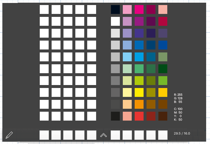
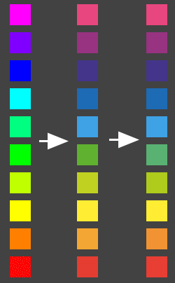
How does one divide a rainbow in 10 colors such that it looks smooth and nice? Good question. When trying to write down 10 colors of the rainbow, it would go approximately like this: red, orange, yellow, lime, green, gren-blue, light-blue, blue, purple, pink. But as seen in the leftmost column in the image to the right, this is not really desirable. There are almost no perceptible differences in the green tones but far too big differences in the blueish tones.
The scientific term behind this problem is called uniformity
. As already said, the RGB colorspace is far from perfect. The distance between a green and a yellow is not the same as the distance between a blue and a purple. The human eye just perceyves those colors differently and hence an easy division by 10
is not possible.
So we just have to adjust them a little. What now follows is basically a cumbersome fiddling of all color values over and over again until a smooth, nice to look at rainbow color palette is there. The center column in the image to the right shows a more refined selection and the column to the far-right is the final set.
Now, these last two columns look indeed smooth and nice but also rather different than the first one. What happened?
Saturated colors hurt!
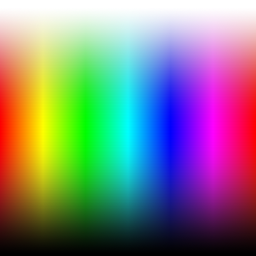
When looking at the first column of the image above again, it clearly stands out from the other two. This is because it uses fully saturated RGB colors. This is especially prominent with light blue and pink. These colors pop out. Why? Because the blue and green channel of RGB are unnatrally bright for everyday vision.
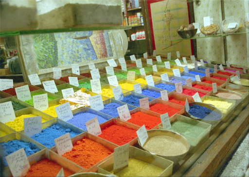
We humans know our world by seeing them with our eyes. We see green grass and blue sky. But even these very powerful colors in nature are nowhere near the saturation of what RGB displays provide. See example to the right where even in a perfectly sunny photograph, pure green and cyan just hurt the eyes.
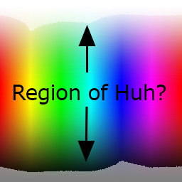
When looking at the full RGB spectrum, there is actually a rather large region which is unnaturally saturated. This is a region which appears unnaturally bright to us when being confronted with on a modern RGB display. Unfortunately, display technologies have become much more saturated over the years, but people still are accustomed to use fully saturated colors in computer programs and especially in vector drawing apps: Pure Red, pure Green, pure Blue...
I tried to go a different route with Karo Graph. I decided to omit these fully saturated values and rather more try to go for a more matte finish, making diagrams look more calm by using less popping colors.


CMYK first, RGB second
How can we desaturate colors of a rainbow such that it still looks nice but is not hurting our eyes anymore? I turned to the CMYK color space. This colorspace is based on the four color inks Cyan, Magenta, Yellow and Black and is quite different to RGB. While RGB is characterized by emitted light, CMYK defines its colors by absorbing light.
There is far too much to discuss when talking about CMYK but the basic twist is that colors in CMYK automatically are more desaturated and simply can not pop out
, as they describe the color of materials (pigments) and not artificial light.
As a matter of fact, the decision to use CMYK has been made long before testing the first rainbow colors. The intention always was, that Karo Graph is mostly used for diagrams, both on screen as well as on paper. So to make diagrams look good on paper I already had to make decisions about the CMYK space in version 1.0 when only using Black and White. Maybe nobody noticed, but converting Diagrams to EPS or PDF actually used CMYK color values from the start. That is why Karo Graph diagrams always looked sharp on every printer.
But now in version 2.0, I want to allow real colors. So I decided very early on that I will present a predefined color palette which has carefully chose values not only in RGB but in CMYK as well. And during the course of the first tests with rainbow colors, it was soon decided that I will design the whole color palette CMYK first and then convert them to a suitable RGB palette in a final step.
Using some advantages of CMYK
Designing a color palette on screen with colors from the CMYK colorspace seems odd at first. The number of colors reproducible by CMYK is severely limited compared to RGB. But as to reiterate again: The colors automatically look more natural, an important factor for a nice palette. But this is not the only advantage.
One advantage of CMYK is that when only using two of the primary colors (not counting black), the resulting color looks very pristine on paper. By simply reducing the amount of ink in all channels proportionally, one can easily create a light
version of the color while maintaining the color tone and having a very stable luminance change over all hues. On the other hand, by simply adding a small amount of Black, every color can simply be darkened, again while maintaining the tone and having a very stable luminance change over all hues.
So I have chosen a very well defined and world-wide adopted CMYK space (FOGRA39) and started to make the rainbow look perfect on screen. Then, as soon as I had the pure rainbow colors defined, the two columns to the left and right of the final palette were defined automatically: A light rainbow and a dark rainbow.
Using such simple rules also helps supressing printer mistakes which are often done when manually selecting CMYK values: Printers tend not to like too much ink at one spot. When all four channels would be at 100% this means that there is a coverage of total 400% per dot. The whole palette of Karo Graph never has more than 250% coverage. This works well with todays printers.

More rainbow colors? What for?
So basically, there are rainbow colors, a 50% lighter variant and a 50% darker variant. And that is all there is to with rainbow colors. There are no other light- or dark-variants of them due to two reasons:
First, the purpose of this color palette is to draw colorful diagrams. Colors in diagrams only make sense if they are distinguishable from each other. Therefore, introducing a semi-half darkened or lightened rainbow does not make sense. And almost black and almost white colors also make no sense as the human eye can not distinguish them enough from pure white and pure black.
Second, there are only 20 colors left in the palette! Let us fill them with much more important colors!
The brilliant Key of CMYK
One kind of color has not yet been observed in the color palette: White, black and any shade of grey. In the Karo Graph palette, the whole first column is completely dedicated to this.
When drawing diagrams of all sorts, black is one of the most important colors as people tend to use it for all sorts of lines. A gray color in Karo Graph is defined to be a Key-Grey, meaning, only the last channel of the CMYK colorspace is used. This has the advantage that only black ink is used and most printers do not even count this as a color print. But it also means that there can not be any color distortions like it may happen with multi-channeled black. You may have experienced this when trying to print a black drawing which was overlayed with a semi-transparent color image.
There are 9 shades of grey in Karo Graph: 0%, 15%, 25%, 35%, 50%, 65%, 75%, 85% and 100%. The distribution of the percentages can somewhat be explained with small percentages like 5% or 10% being very hard to print and differences in the 50% area being hard to depict to the human eye. But frankly, it is kind of experience-based.
Additionally, there is a separate black which is called brilliant black
. It consists of not only 100% black but additional 100% cyan. It has a much darker and cooler look when printing.

Rainbows do not solve everything
The spectral colors are nice and already serve a great purpose: Drawing with colors which are very distinguishalbe from each other. But the rainbow colors actually only cover a relatively small amount of colors of the full visible color space: The so called primary and secondary colors.
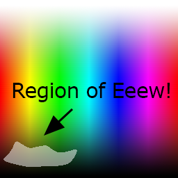
Colors which are a mixture of three channels are called ternary colors and are not part of the rainbow. Nontheless, we as humans are used to these colors in everyday use, as they represent skin tones, shades of brown, shades of olive... Sometimes, these colors are perceyved as dirty
as we tend to compare it with wee-wee, poo-poo and Barf, but this is just a sidenote.
Luckily, there are not too many colors necessary to be satisfied with our color palette. Many of the ternary colors look very similar to the light or dark versions of the rainbow colors, hence we only need the most important ones and we put them in the fifth column in the Karo Graph color palette. Further more, as the palette is defined in CMYK, we are still missing a somewhat beautiful blue and a nice pure green.
The following colors have been chosen based on the observation of many other color palettes, from bottom to top: Wood (a very dark brown), Caramel (a less dark brown), Mango (Yellow with a touch Red, very good for printing), Grass (a somewhat saturated green), Forest (a deep, dark green), Olive (a desaturated green), Ocean (a somewhat saturated blue), Blueberry (a dark desaturated violet), Lipstick (quite an aggressive purple) and Pig (looks a bit like Marzipan).

Stiching all togehter
All these ideas and decisions lead to five columns of 10 colors. Combining them together results in the image on the right. Final adjustments were made by changing the background grey to different levels. With that, small changes have been introduced to various secondary and ternary colors as they always look different depending on what background there is.
By changing the background gray, it can be assured that all colors are distinctly different from each other and hence have a special purpose. Also, by setting the background to white, It has been assured that all colors (except white itself) have a good contrast to the white background of the paper.
Then, in a last step, all colors have been manually converted to RGB values of the Webcolor palette. This palette helpes webdesigners to remember color names easier by defining three hexadecimal values which always have two repeated hexadecimal digits. For example, the color Grass
has values #77bb33. Of course, this again limits the number of colors in the RGB space and the resulting color does not match the CMYK representation exactly, but it is sufficiently close.
All values then have been hard coded into Karo Graph and are accessed and applied to the screen with system-wide color transformations or with manual computation. This alone would be a whole topic to talk about but let us just say, it does something which is not entirely wrong.
This basically concludes, how the palette came to be. It took several hours and lots of fiddling around. But it is worth it as the customer eventually only has to choose and Karo Graph does the rest.